An archive of every blog post that shipped with astro-erudite v1.
Caution (Out of date)
Everything in here is out of date and does not reflect my current opinions or the current codebase. These posts document astro-erudite v1, which has since been rebuilt from the ground up.
These are the posts that accompanied astro-erudite v1’s releases, preserved as written.
There should not be a single reason why you would need a command palette search bar to find a blog post on your own site.
Introduction
Hello! My name is enscribe (jktrn on GitHub), and I’m a fullstack web developer who has been fiddling with blogging platforms for a couple of years now. I run a blog at enscribe.dev, where I write about cybersecurity and the capture-the-flag (CTF) scene.
I have a lot of opinions about what makes a great blogging template. As a cumulative result of all the slop, bullshit, and outright terrible design decisions I’ve had to deal with working with various templates and frameworks, I bring you astro-erudite, which should hopefully bring a better developer and user experience in terms of ease of use, customization, and performance.
astro-erudite is written in Astro, a framework hyperoptimized for static content such as blogs. Aesthetically, it is also designed to be as boring as possible while still maintaining maximum functionality, as to allow for the freedom of the developer (or the designer they hire) to make their blog uniquely their own. Within the codebase of this template I’ve included many nuances that, in my opinion (and there will be many, many opinions here), make the developer experience significantly more pleasant. I’ve also excluded many features that, frankly, you don’t need.
Welcoming some DX features
This is a non-exhaustive list of features I believe are essential for a frictionless developer experience:
shadcn/ui is a pretty controversial component library. I love it. I don’t care much for the components themselves as they are literally Radix primitive wrappers—however, the best part is arguably its take on theming, which introduces a convention involving CSS colors such as background and foreground into your Tailwind configuration so that styling is a breeze. These classes also automatically adapt to the user’s selected theme, and as such you don’t need to worry about adding an equivalent dark: style to all of your theming. shadcn/ui turns "bg-stone-50 text-stone-900 dark:bg-stone-900 dark:text-stone-50" into "bg-background text-foreground", both more semantic and easier to blanket edit (if you wanted to change all your blues in your site to indigos, you would need to go around every single class and change it rather than editing a single CSS variable). Other utility colors such as secondary, muted, accent, and destructive also exist and are very self-explanatory in name (and also have an equivalent -foreground class, e.g. secondary-foreground, which you can apply to text on top of these colors).
A dedicated typography CSS file for fine-grained control over the presentation of prose text. Although Tailwind Typography (a plugin that automatically styles any content surrounded by an <article> tag) offers a solution to this, you lose out on all of the control and often have to make overrides for undesirable output. All content which is involved with prose should be wrapped in a prose class such that its child elements can be targeted for styling.
Expressive Code is a beautiful solution for code blocks that, under the hood, uses Shiki for syntax highlighting. Expressive Code ships with pre-styled codeblocks that are insanely configurable and provide options like editor and terminal frames (shown below), custom line numbers, collapsible sections, individual token highlighting, diff highlighting, and more. To use these for any provided codeblock, simply add any of the following props after the codeblock’s backticks:
If you specify a language that’s typically used within a terminal context (e.g. ps1, sh, console, etc.) then the frame of the codeblock will instead look like a terminal:
Expressive Code unfortunately does not support inline syntax highlighting like this: console.log('Hello world!'). The colors you currently see now are handled by rehype-pretty-code, which I patched to only apply syntax highlighting to inline code and not codeblocks. To read more about this process, see the next blog post: v1.3.0: “Patches in Production”.
The cn() function is a utility function which combines clsx and tailwind-merge, two packages which allow painless conditional class addition and concatenation:
src/lib/utils.ts
1
import { type ClassValue, clsx } from'clsx'
2
import { twMerge } from'tailwind-merge'
3
4
exportfunctioncn(...inputs:ClassValue[]) {
5
returntwMerge(clsx(inputs))
6
}
This needs to be in every single template. This is an example of it being used in my <Link> component:
Concatenate whatever the user passed via the class prop to our base styles
Conditionally add an underline if the underline prop is true
Awesome!
Welcoming some UX features
Within the blog itself (as in the layout, appearance, and navigation) are features that I believe are essential for a great user experience:
Images are awesome and, by default, your blog post should have an image associated with it as part of the post’s Open Graph metadata. Since you can do whatever you want with the image, all of my dummy posts will have a placeholder image placed within their folder in src/content/blog/. Whenever you load into a blog post, splat in the middle will be the image associated with that post in its frontmatter.
Theme selectors should be self-explanatory. I’ve added one on the top right of the header, which is also sticky and not absolute such that it doesn’t ignore the document flow (and thus you won’t have to add mt-20 to the top of every single page).
The table of contents of a post shouldn’t be reduced to a <detailsclosed> at the start of a blog post on desktop. You’d need to go to the top of the page to navigate through items. I’ve added a sticky <TableOfContents> component which always hangs out around the unused left side margin of a blog post. I also attached a very tiny client-side script using IntersectionObserver to highlight all of the headings you’re viewing within the TOC as you scroll through the page—it also will handle nested headings in that the parent heading of a visible child will still be highlighted even if off-screen (see the dummy 2024 Post for an example of this). I’ll still use a collapsible <details> element for the table of contents on mobile though since obviously a table of contents on the side is unfeasible for small screens.
Every page, except the homepage, will have a <Breadcrumb> component which shows you your current location in the site hierarchy. I don’t see these often in blog templates even though they are so amazing for both discoverability (SEO and crawling) and user experience (the user always knows how “deep” they are in the site).
You can specify multiple post authors via frontmatter. If this post author’s ID is found within the Authors collection, then it will render particular info from that author’s frontmatter file, [author-name].md (e.g. avatar, link to profile). For example, the previous post (2024 Post) has two authors: “enscribe” and “jktrn”, where “enscribe” is the only author with a custom avatar since “jktrn” is unregistered.
Each author will have their own page, which lists all of their posts. If you’re the only author throughout the entire blog then you can simply disregard all aspects regarding both inserting authors and the Authors collection.
Each tag will also have their own page, which lists all of the posts under that tag!
Goodbye, ESLint! There have been so many occasions where I’ve had to deal with blogging templates with in-built pre-commit hooks which enforce contrived and arbitrary linting rules that, frankly, I couldn’t be bothered with. Obviously, linting is awesome for ensuring consistency and best practice, but that’s for shared and large codebases. You’re dealing with, at most, your MDX blog posts and some interior fetching. It’s just not worth the headache.
You probably don’t need analytics via Umami or Plausible. Let’s be realistic: for many personal blogs, unless you’re an anime profile picture Twitter microcelebrity, you don’t need to know how many of your readers click Big Button A versus how many click Big Button B.
You likely don’t need a comments section via Giscus. This opens up a can of worms involving the ability to spam comments and the necessity to moderate them. If you want organic discussion about your blog posts to happen, then share on social media and let people discuss there.
Speaking of sharing on social media, let’s get rid of the share buttons. When was the last time you actually used a share button on a blog post rather than just copying the URL?
You probably don’t need a CMS unless you have thousands of posts and/or are willing to navigate through a clunky management interface. Markdown and folders is really all you need, which you can organize to your preference via folder or file naming conventions.
If you have literally anything involving an .env file in a blogging site, maybe think about what you are doing for a moment.
Please consider not overriding the browser’s Ctrl + K functionality to open up a command palette. There should not be a single reason why a user would use a small context menu to browse your blog over the /blog route. Most of the time, command palettes on sites do nothing more than regurgitate shortcuts that are already on the same page you’re hiding with the palette’s modal.
Something important
Obviously a disclaimer: everything that I’ve shared here are my own personal gripes and, while I’d like for you to agree with me on a lot of these points for the better of the community, you can go ahead and disagree. The web development community, especially in spaces like Twitter and various online forums, is constantly engaged in heated debates about what constitutes “best practices.” You’ll find a wide spectrum of viewpoints:
Fundamentalists who adhere strictly to established patterns and completely disregard change,
Accelerationists who eat up whatever Vercel cooks as if it’s the second coming of Christ,
and everyone in between this spectrum.
I wanted to share what particular technology stack worked the best for me in this particular use case. A stack for one project can be completely unusable for another. If you vehemently hate any of the design choices I’ve made then simply get rid of them. MIT license! Happy blogging.
Whenever you depend on Node packages with missing maintainers, patching becomes a necessary evil.
A problem (about dead maintainers)
This post talks about changes I’ve made to astro-erudite in v1.3.0!
I recently found myself caught between two syntax highlighting packages that I absolutely needed for astro-erudite. On one hand, the current template uses rehype-pretty-code as its main syntax highlighting solution, but due to issues with its inherent implementation and missing features that I needed, I had created a bunch of custom transformers to make it do what I wanted, and the whole setup was getting unwieldy. I then discovered Expressive Code, which had everything I wanted out of the box—collapsible code sections, terminal and editor frames, gutter comments—it was perfect! Well, almost perfect.
The primary issue was that Expressive Code doesn’t support inline syntax highlighting, which is non-negotiable for me since I need my inline code snippets to look as good as my code blocks (so I could do stuff like console.log("Hello, world!".split('').reverse().join(''))). So I opened a feature request at expressive-code/expressive-code#250 and the maintainer seemed interested, saying they’d get around to it eventually. Implementing this feature is a lot easier said than done though, and I summarized it well in another thread:
@jktrn: […] expressive-code is already interested in implementing inline code support, but it would be a bit nuanced to add since it has to:
allow existing plugins to continue working normally with block-level code (without breaking changes),
enable new plugins to explicitly declare support for inline code,
and provide ways for plugins to distinguish between inline and block-level code processing.
However, I needed a solution immediately. My first thought was to use both packages together—Expressive Code for block code and rehype-pretty-code for inline code. However, importing both at the same time caused everything to break spectacularly.
The hunt for a solution
Digging into the rehype-pretty-code docs, I noticed they had a bypassInlineCode option that lets you skip inline code highlighting (it was actually added in a really recent update). But what I needed was the opposite, which would be a way to make it only handle inline code and bypass blocks entirely.
So I opened a feature request at rehype-pretty/rehype-pretty-code#247 for a theoretical bypassBlockCode option. I got no response, since the repository seemed unmaintained for a bit since it seems like the maintainer has moved onto other projects.
Fast forward a few months, and user @kelvindecosta comments on my issue:
[@kelvindecosta]: Hey @jktrn, did you figure out a workaround for this? I’m interested in setting this up alongside expressive-code.
After I replied that I hadn’t figured out a workaround yet, they sent me a brilliantly hacky solution a couple days later:
[@kelvindecosta]: Hey again @jktrn, I have found an unconventional way to achieve this.
If you’re using pnpm or bun, you can use their patch functionality to customize the contents of the node_modules/rehype-pretty-code package.
I only recently learned about this feature, and it is a good workaround for the time being. Here are the steps:
Run pnpm patch rehype-pretty-code. This will instruct you to edit the files in a certain directory.
Patch out the isBlockCode function to always return false. This will instruct the plugin to not process any block code elements.
Run pnpm patch-commit <path/to/files>. This will create a nice patches folder with the right changes.
Performing surgery on node_modules
This happened to be exactly what I needed! I went into my node_modules directory and made the changes manually:
function getInlineCodeLang(meta, defaultFallbackLang) {
11
const placeholder = "\0";
This simple modification forces rehype-pretty-code to completely ignore block code elements by always returning false from the isBlockCode function. Now Expressive Code handles all block code formatting, while rehype-pretty-code still beautifully handles my inline code. And just like that, they’re working in perfect harmony!
Please don’t perform surgery on your node_modules
Absolutely do not do this for production sites (your personal blog does not count = ̄ω ̄=). Directly patching node modules is generally discouraged because patches can break with updates and create maintenance headaches down the road.
But sometimes, when you’re working at the bleeding edge of web development, temporary solutions like this become necessary. The better approach would be to just wait for Expressive Code to implement inline syntax highlighting. But, since it’ll take a while for reasons aforementioned, I’ll stick with my janky solution. This patch buys me time until either rehype-pretty-code gets maintained again and implements the feature properly, or Expressive Code adds inline code support.
In the meantime, astro-erudite now has both beautiful code blocks and inline syntax highlighting. And now it’s available for all of you to use!
A quick update introduces our first content-based component: the callout!
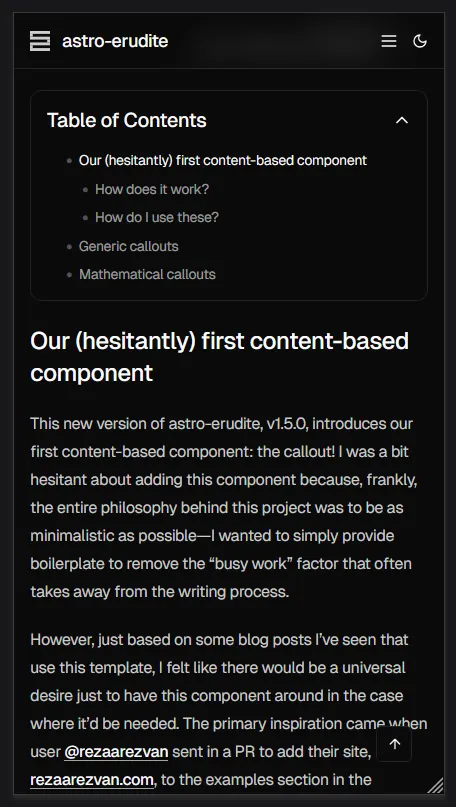
Our (hesitantly) first content-based component
This new version of astro-erudite, v1.5.0, introduces our first content-based component: the callout! I was a bit hesitant about adding this component because, frankly, the entire philosophy behind this project was to be as minimalistic as possible—I wanted to simply provide boilerplate to remove the “busy work” factor that often takes away from the writing process.
However, just based on some blog posts I’ve seen that use this template, I felt like there would be a universal desire just to have this component around in the case where it’d be needed. The primary inspiration came when user @rezaarezvan sent in a PR to add their site, rezaarezvan.com, to the examples section in the README. They had years upon years of accumulated notes and resources on their site, most of which were in the form of LaTeX-style academic content that requires “blocks” for things like definitions, theorems, and proofs. I sent in an encouraging reply to the PR and then started building the component:
[@jktrn] your blog posts are literally insane btw @rezaarezvan how have you written multiple textbooks worth of educational resources???
i think i might add latex-style theorem/lemma/corollary/def/proof/eg/ex/remark blocks to astro-erudite so i can accommodate for these academia-style blogs, like e.g. for exercises it’d just be a component with an expandable section to hide the answer
How does it work?
I’ve added a simple Callout.astro to src/components that now comes shipped with the template. It’s a very easy-to-read component that has an insanely long configuration scheme for all of the different types of callouts that I’ve added. Fundamentally, it follows the same paradigm as shadcn/ui which uses class-variance-authority to create different “variants” on top of a base styling scheme:
src/components/Callout.astro
1
---
2
import { cn } from'@/lib/utils'
3
import { Icon } from'astro-icon/components'
4
import { cva, type VariantProps } from'class-variance-authority'
As such, if you feel like there’s any variant that you’re missing, it’s insanely trivial to add it yourself. It’s less trivial, however, to figure out what colors to use since I’ve essentially taken up every good Tailwind color for these!
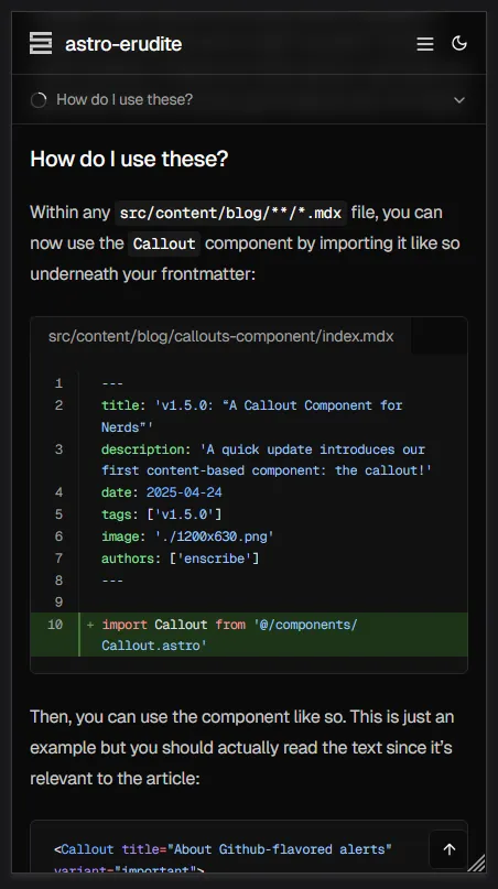
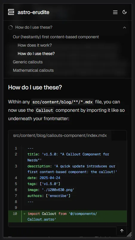
How do I use these?
Within any src/content/blog/**/*.mdx file, you can now use the Callout component by importing it like so underneath your frontmatter:
src/content/blog/callouts-component/index.mdx
1
---
2
title: 'v1.5.0: “A Callout Component for Nerds”'
3
description: 'A quick update introduces our first content-based component: the callout!'
4
date: 2025-04-24
5
tags: ['v1.5.0']
6
image: './1200x630.png'
7
authors: ['enscribe']
8
---
9
10
import Callout from'@/components/callout.astro'
Then, you can use the component like so. This is just an example but you should actually read the text since it’s relevant to the article:
I know that Github typically uses the following syntax for "alerts" (which is what they call these callouts, you can see their documentation [here](https://docs.github.com/en/get-started/writing-on-github/getting-started-with-writing-and-formatting-on-github/basic-writing-and-formatting-syntax#alerts)):
9 collapsed lines
```md showLineNumbers=false
> [!NOTE]
> Useful information that users should know, even when skimming content.
```
The above syntax is supposed to render like this:
<Callout>
Useful information that users should know, even when skimming content.
</Callout>
I believe they do this so they can keep you within the Markdown-like syntax system. However, since this is MDX, I thought we'd be better off just using the component paradigm since it's a bit impractical to make a rehype plugin that can parse this form of syntax (also, solutions for this already exist, such as [lin-stephanie/rehype-callouts](https://github.com/lin-stephanie/rehype-callouts)). Additionally, I find it a pain to work with the `>{:md}` (the `<blockquote>{:html}` indicators for Markdown) syntax, as it makes it difficult to nest things such as code blocks within them in pure Markdown. We'll use components for now!
</Callout>
Important (About Github-flavored alerts)
I know that Github typically uses the following syntax for “alerts” (which is what they call these callouts, you can see their documentation here):
> [!NOTE]
> Useful information that users should know, even when skimming content.
The above syntax is supposed to render like this:
Note
Useful information that users should know, even when skimming content.
I believe they do this so they can keep you within the Markdown-like syntax system. However, since this is MDX, I thought we’d be better off just using the component paradigm since it’s a bit impractical to make a rehype plugin that can parse this form of syntax (also, solutions for this already exist, such as lin-stephanie/rehype-callouts). Additionally, I find it a pain to work with the > (the <blockquote> indicators for Markdown) syntax, as it makes it difficult to nest things such as code blocks within them in pure Markdown. We’ll use components for now!
Callout only supports three props:
Prop
Description
Default
title
The title of the callout
undefined
variant
The variant of the callout
"note"
defaultOpen
Whether the callout <details> box is open by default
true
I’ve added an insane amount of variants to this component for potentially any use case you could think of. For the more general ones, you can use the following:
Variant
Usage
Note
For general information or comments that don’t fit other categories
Tip
For helpful advice or shortcuts related to the topic at hand
Warning
For potential pitfalls or common misconceptions
Danger
For things that could potentially be destructive or harmful
Important
For things that are important to the reader’s understanding
Generic callouts
These are what the generic callouts look like (of course, all the text is made up):
Note (Prerequisites for advanced React development)
This tutorial assumes you’re familiar with React hooks and the component lifecycle. If you need a refresher, check out the official React documentation before proceeding.
Tip (Productivity enhancement)
You can quickly format your code by pressing Ctrl + Alt + F (Windows/Linux) or Cmd + Option + F (Mac).
Additional shortcuts include:
Action
Windows/Linux
Mac
Search
Ctrl + F
Cmd + F
Replace
Ctrl + H
Cmd + H
Save all
Ctrl + Alt + S
Cmd + Option + S
::::
Warning (Cross-browser compatibility issues)
This API is not supported in Internet Explorer and has limited support in older browsers. Make sure to include appropriate polyfills.
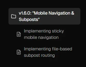
This new version introduces improved mobile navigation (via sticky table of contents) and the concept of "subposts."
Two major improvements to the reading experience
astro-erudite’s v1.6.0 brings about two significant enhancements that I’ve been wanting to implement for quite some time! The first addresses a longstanding mobile UX issue, while the second introduces a content organization paradigm that I find interesting.
Mobile navigation
The original table of contents implementation was frankly inadequate for mobile users. While desktop users enjoyed a beautiful sticky sidebar with scroll-aware highlighting, mobile users were stuck with a basic collapsible <details> element that provided no indication of reading progress or current location within the post:
The new mobile navigation system introduces a sticky header that sits just below the main site navigation, featuring a circular progress indicator and dynamic section display. As you scroll through a post, the progress circle fills to show how far you’ve read, while the text updates to reflect which section you’re currently viewing. Tapping on this header expands a comprehensive table of contents that mirrors the desktop experience but in a mobile-friendly format:
This gives users the same level of navigation control as if they were on desktop, in a very intuitive and mobile-friendly format.
Subposts for hierarchical content organization
The second major feature is something I’m calling “subposts,” a way to organize related content in a parent-child hierarchy within your blog. This concept came from when I was writing this travel blog post on my personal site, where I essentially wanted a “subpost” for each day of the trip since it was way too long to fit into a single post.
Instead of creating separate blog posts in a “series” (and thus clogging up your blog post listings with a bunch of smaller, tangentially-related posts), you can now automatically establish a parent-child relationship between posts by creating a folder for your main topic with an index.mdx file as your parent post, then adding additional .mdx files in the same folder as subposts. For example, this very post demonstrates the feature by containing two subposts that explore the technical implementation details of each feature. On desktop, we display a <SubpostsSidebar> component on the right-hand side of the page that shows a list of all the subposts alongside the parent post:
Terminal window
src/
content/
blog/
mobile-nav-and-subposts/
index.mdx
mobile-navigation.mdx
subposts.mdx
The file structure is intuitive: create a folder for your main topic with an index.mdx file as your parent post, then add additional .mdx files in the same folder as subposts. Astro’s file-based routing handles the URL structure automatically, creating paths like /blog/subposts for the parent post and /blog/subposts/mobile-navigation and /blog/subposts/subposts for the subposts.
Enhanced navigation patterns
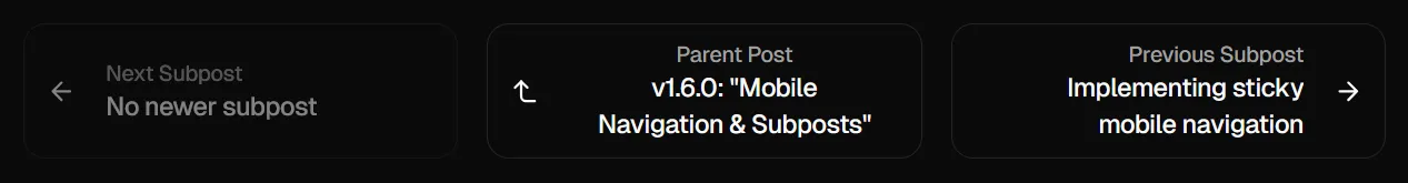
Of course, we need to adjust our <PostNavigation> component to support this new feature. Now, whenever we’re reading a subpost, we now have the option to traverse between subposts or even upwards to the parent post:
This is contextually aware, meaning that if you’re reading a parent post (or a post with no children), then this component will only show adjacent parent-level posts.
Hint: this is great for technical content
The subposts feature particularly shines for technical content which is meant to educate. In a similar manner to a tutorial or a textbook, we can now fragment our content into more digestible and informative subposts which are easily traversable between each other and from the parent post, and the reader is now free to jump around to whichever subpost they’re interested in.
This post itself serves as an example, since you’re currently reading the parent post (which I’ve called the “Index” post in the <Breadcrumb> component) and the subposts are the two posts that I’ve written about the technical implementation details of each feature.
What’s great about the way I engineered subposts is that it’s fully backwards-compatible with blog posts written before this, so there’s no need to define extra frontmatter metadata or manually establish the parent-child relationships between posts. It serves lovely on the DX side as well!
Go ahead and read the subposts
On desktop, the <SubpostsSidebar> sticks to the right column on your screen, and you can click on any of the subposts to read them. On mobile, it will turn into a <SubpostsHeader> component that will appear underneath the sticky header, above the sticky table of contents we just added.
Implementing sticky mobile navigation
The original mobile table of contents was a simple collapsible element that lived within the post content. This created several usability issues:
Users had no sense of how much content remained other than implying it based on the length of the browser scrollbar
Once you scrolled past the TOC, you lose the ability to quickly navigate to other sections of the post without scrolling back up to the inline TOC
Mobile users should have the exact same experience as desktop users in terms of navigation, and as of now the desktop experience was better (due to the sticky aside TOC)
Building the sticky header system
Design-wise, the component is relatively simple, since it only includes a chevron to indicate expansion state, a circular progress indicator that fills as you scroll, and a dynamic text showing the current section (or a combination of sections, if multiple are visible at the same time).
Live scroll highlighting sucks
One of the more interesting problems I encountered was how to handle the highlighting of sections as you scroll. Of course, this applies to both mobile and desktop versions, but in this update I changed the implementation of both.
A naive implementation of live scroll highlighting would simply use an IntersectionObserver() to watch for headers entering and exiting the viewport. The issue with this is that it doesn’t highlight anything if headers are no longer visible in your viewport, regardless of whether you’re in a section that “belongs” to a heading.
Note (Example)
Say that we have a post with the following structure:
1
## Part 1
2
[500 lines of content]
3
4
## Part 2
5
[500 lines of content]
If you were to scroll way past the first heading and was deep into the first section underneath it, the naive implementation would not highlight the first heading because it’s no longer in your viewport. This is unintuitive and a poor user experience. In a perfect world, if we were to view 250 lines of Part 1 and 250 lines of Part 2, then we would see both headings highlighted in the TOC and not need to make a decision about which heading to highlight.
I used to rely on jakelow/remark-sectionize, a remarkjs/remark plugin that retroactively generates <section> tags based on the headers in the generated HTML. This would have done the following conversion:
1
# Forest elephants
2
3
## Introduction
4
5
In this section, we discuss the lesser known forest elephants.
6
7
## Habitat
8
9
Forest elephants do not live in trees but among them.
1
<section>
2
<h1>Forest elephants</h1>
3
<section>
4
<h2>Introduction</h2>
5
<p>In this section, we discuss the lesser known forest elephants.</p>
6
</section>
7
<section>
8
<h2>Habitat</h2>
9
<p>Forest elephants do not live in trees but among them.</p>
10
</section>
11
</section>
However, this approach had pretty complicated issues involving section nesting and the fact that we didn’t have any control over its output other than by patching it. So, I decided to opt for a home-grown solution.
The concept of “jurisdictions”
The naming is interesting but I felt like it was the most intuitive to me. Basically, I created a system that assigns each heading a “territory” that extends from its position to the start of the next heading (or the end of the document):
First, we collect all heading elements (<h2> through <h6>) from the document’s prose content area using .querySelectorAll().
For each heading, we create a jurisdiction object that contains the heading’s id, the vertical position where this section begins (the heading’s offsetTop value, which we name start), and the vertical position where this section ends (the offsetTop of the next heading or the bottom of the document if it’s the last heading, which we name end).
This creates a map of “territories” that each heading controls. This is crucial for accurately tracking which jurisdictions are currently visible as the user scrolls, even when the actual heading element itself is no longer in view.
The decision to show all visible sections
One of the more interesting decisions I made was to display all sections as comma-separated within the mobile TOC’s unexpanded state. This manifests as follows:
Note (Example)
Recall the previous example’s scenario:
1
## Part 1
2
[500 lines of content]
3
4
## Part 2
5
[500 lines of content]
If we saw 250 lines of Part 1 and 250 lines of Part 2, then the text snippet in the mobile TOC would read “Part 1, Part 2”.
The temptation is to implement a “smart” selection algorithm, perhaps showing the section with the most visible content, or the one closest to the viewport center, or to show the “deepest,” most specifically nested section. However, this creates numerous edge cases:
If you click to navigate to a short final section, it might never become the “primary” section because there isn’t enough content below it to scroll it to the top of the viewport.
As you scroll between sections, a “smart” selector might switch which section it considers primary at seemingly arbitrary points, creating a jarring experience.
When your viewport shows roughly equal amounts of two sections, any selection algorithm becomes essentially arbitrary.
By showing all visible sections, we give users complete awareness of their position in the document, eliminate the edge cases mentioned above, and create predictable behavior.
Progress indicator implementation
The circular progress indicator provides immediate visual feedback about reading progress without requiring any interaction:
The progress is calculated as a ratio of current scroll position to total scrollable distance, then applied as a stroke-dashoffset to create the filling effect.
Implementing file-based subpost routing
The subposts feature leverages Astro’s file-based routing to automatically detect parent-child relationships without any configuration. The entire implementation hinges on a simple observation: if a post ID contains a forward slash, it’s a subpost.
This is a pretty elegant solution which requires no frontmatter configuration, no manual relationship mapping, and zero migration effort for existing posts.
Navigation complexity
One of the more intricate parts of this update was rethinking navigation. The original getAdjacentPosts() function assumed simple previous/next relationships. With subposts, we now have three distinct navigation contexts:
Note (Example)
Consider this structure:
1
blog/
2
getting-started.mdx
3
react-tutorial/
4
index.mdx
5
components.mdx
6
state.mdx
7
advanced-patterns.mdx
Navigation depends on context:
From getting-started.mdx: next goes to react-tutorial/index.mdx
From react-tutorial/components.mdx: next goes to state.mdx, previous to index.mdx
From react-tutorial/state.mdx: previous goes to components.mdx, parent goes to index.mdx
As a TL;DR, subposts should only navigate among siblings and should be able to go up to their parent, while parent posts should only navigate among other parent-level posts.
Other considerations
The breadcrumb component required careful thought to handle three distinct cases:
We append -text to book-open or file (for parent posts and subposts, respectively) to indicate the active post by differentiating it from inactive icons which would lack the text within the icon.
The main blog listing (alongside other listings, e.g. filtering by tags, filtering by author) should exclude subposts to avoid cluttering the feed:
.sort((a, b) => b.data.date.valueOf() - a.data.date.valueOf())
12
}
Without this filter, your blog listing would show every subpost as a top-level entry, defeating the purpose of hierarchical organization.
Desktop and mobile require fundamentally different approaches for displaying the subpost hierarchy. On desktop, we have the luxury of a persistent sidebar. On mobile, screen real estate demands integration with the sticky header system. This required careful slot management in the top-level Layout.astro:
The order is semantic here since subposts navigation comes before table of contents, creating a logical hierarchy of navigation options from broad (which post/subpost) to specific (which section).
Not much testing has been done for deep nesting but my assumption is that it shouldn’t work. This is intentional to maintain simplicity, since at that point you might as well use a documentation site rather than a blogging site.